Starting fresh for 2014-15... (New court, logo, secondary logo...)

Is a new logo a good idea?


  • Total voters
    19
Surprised that no one has started a thread yet....

So, not only do we get to show off new uniforms, we will be rocking a new court and two new logos...

The article:

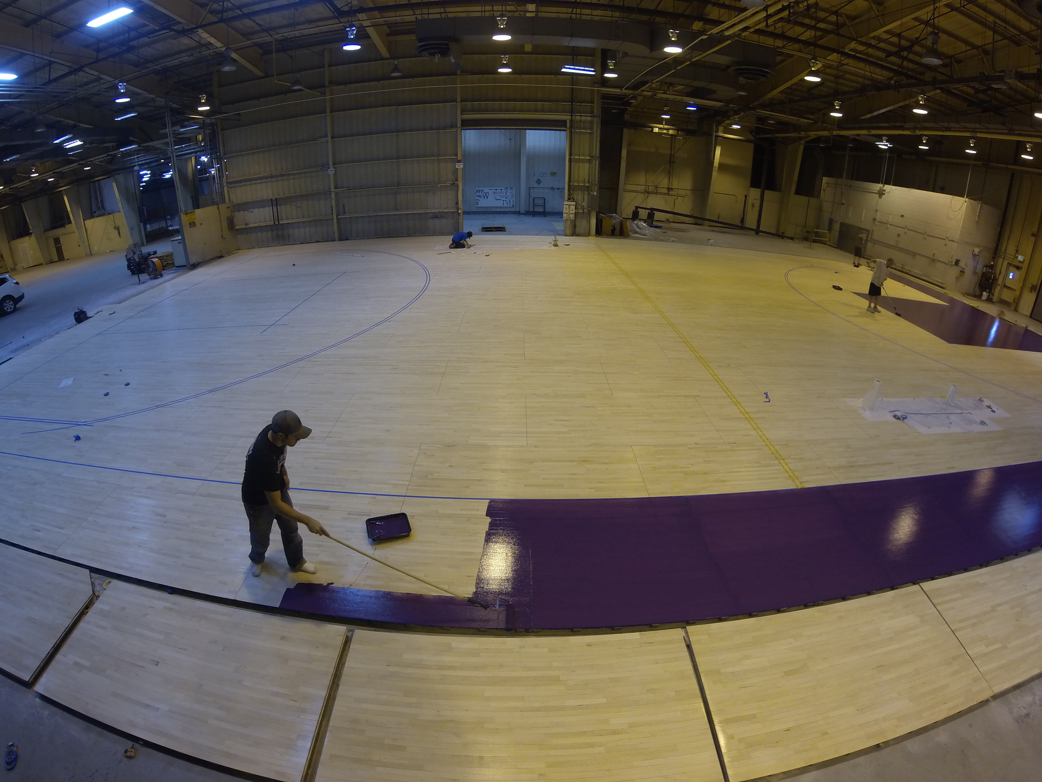
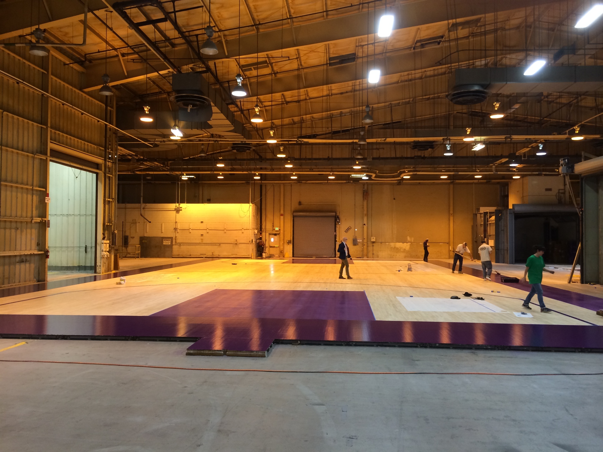
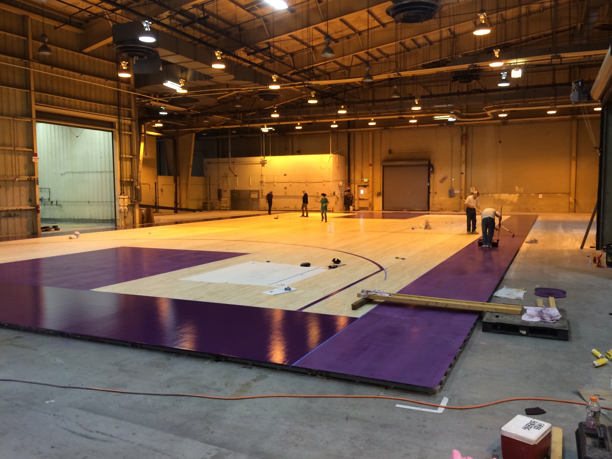
"The Kings today announced that along with the new uniforms, the Sleep Train Arena Court would also be updated.

Some of the features of the new court include purple sidelines, an updated center court team logo and a Sleep Train Arena and Crown Logo.


While the court has yet to be completed, the Kings did share some pictures and video of the work in progress:


Like the updated uniforms, the court seems to be using a brighter shade of purple than in years past, as the Kings' primary color has been more bluish-purple. This of course is a throwback to the purple used by the Kings from about 1995 to 2003.

It's currently unknown what the center court logo will be, but I think it's a good bet that it will involve the stylized "KINGS" found on the new jerseys and currently being used as the primary logo on Kings.com."

http://www.sactownroyalty.com/2014/...o-kings-to-debut-new-court-for-2014-15-season

Hoping it's more than just a logo that says "KINGS"...

Oh and there's a video inside the article if you wanna check it out.
 
I can barely rouse myself to care about jerseys, let alone courts. :p

However, the old logo was nice looking. Hope they don't screw with it too much in their continuing efforts to rebrand absolutely everything. Its all a bit noveau riche for my tastes.
 
The logo is fine, it's unique and it should be left as is. I like the SK logo as the secondary logos, those look legit. Darker purple on those sidelines it seems, I'm game for that too.
 
The old logo IS fine but an updated court logo to match the crossed lances would be great. We're still the Kings. If everything changes, we've lost part of what we fought so hard to keep.

Having said that, I like the idea of going to a truer purple color. It was always disconcerting to me to watch a game and have the jerseys look more blue than purple.

EDIT: Here's what the court logo was last year:

cropped.jpg
 
Last edited:
I would loved for the team to go back to the Red and Blue from the mid 80s. I know that is not going to happen though. First, they pushed the forever purple thing very hard during the owner transition. Second, purple is a very popular color in India. Not that red and blue aren't, but the red and blue we had would not be as marketable over there as the deep purple they are seemingly changing to.
 
I would loved for the team to go back to the Red and Blue from the mid 80s. I know that is not going to happen though. First, they pushed the forever purple thing very hard during the owner transition. Second, purple is a very popular color in India. Not that red and blue aren't, but the red and blue we had would not be as marketable over there as the deep purple they are seemingly changing to.

The whole royal purple thing is too ingrained as part of the Kings to be taken away. It's not just something the new ownership supports. It's something the vast majority of the fan base has wanted. The only thing most fans were vocal about was bringing back the black alternates...after we eliminated the gold lamé. which was pretty clearly the only jersey color actively shunned by Kings fans.
 
I like the Kings purple but it keeps me from wearing Kings hats or shirts. Just doesn't look right on most guys.

I think that's one of the reasons the black shirts, hats, etc. have always been so popular.
 
I like the Kings purple but it keeps me from wearing Kings hats or shirts. Just doesn't look right on most guys.
If you like it, wear it. Purple is the color of royalty. If someone has a problem with it, it's not my problem.
 
Having said that, I like the idea of going to a truer purple color. It was always disconcerting to me to watch a game and have the jerseys look more blue than purple.

Though some of that is the fact that the television camera does a poor job of rendering the purple color of our uniforms. Most TV broadcasts make our jerseys look much closer to dark blue than they are in person.
 
I think that's one of the reasons the black shirts, hats, etc. have always been so popular.

This is true. I also don't have a whole lot of 49ers merchandise either because I'm just not a big fan of the colors. Other teams like the Bears have much better colors in my opinion.
 
Everything about the new court is great

and man that court last year was beat to hell. Did anyone ever get close to it and see the gouges in the wood in the key? it was awful
 
Everything about the new court is great

and man that court last year was beat to hell. Did anyone ever get close to it and see the gouges in the wood in the key? it was awful

Oh i certainly did! Lots of scuff marks all over it lol I'm sure the new court is going to look great! I never was fond of the "Kings" on this one...
 
Start wearing purple wearing purrrrplleee...

They should freaking play this song at Kings games.


Yes, yes, yes and another yes.
If anyone has twitter, shmacebook, or any other social media that connects to Vivek, or a Kings PR person, please send that video to them.
That would really get the fans going IMO
 
Yes, yes, yes and another yes.
If anyone has twitter, shmacebook, or any other social media that connects to Vivek, or a Kings PR person, please send that video to them.
That would really get the fans going IMO

I know right? It's like there couldn't be a more perfect song for Kings fans. Even has that slavic feel to it.
 
I know right? It's like there couldn't be a more perfect song for Kings fans. Even has that slavic feel to it.

I sent a couple of emails to management and actually got a response from Andrew Nicholson, the Kings director of digital:

Andrew Nicholson said:
Hi, xxxx-

Thank you for your kind note and loyal support of the Sacramento Kings.

I’ve passed along your message to our Entertainment Team, who manages the in-game experience at home games.

Thanks again, and Go Kings!

Regards,
-Andrew


Andrew Nicholson
Director, Digital

god...I hope it happens
 
Yep it was at the home opener last season when the team gave everyone a purple shirt. They played that song whilst outing people not wearing purple on the jumbotron.

That's kind of the exact scenario I had envisioned. It's nice to hear they are a step ahead of my step ahead of where I think they should be. I think that puts us on the same page, and Fear the Putin is there too. I love it when I predict the future and it has already happened. It's affirming.
 
Back
Top