Dreadnought
Bench
As a disclaimer, I don't mind the logo. But...
"Inspired by the past..."
You mean an almost 99% copy of an already existing logo?
"Inspired by the past..."
You mean an almost 99% copy of an already existing logo?
Wait till the Kings play the Hawks.

 Ailene VoisinVerified account@ailene_voisin
She is literally the worst
User Actions
Follow
Ailene Voisin Retweeted SportsCenter
Still hoping Kings add some black to the color scheme. Design is color, but color purple and gray colors? Yawn.
I think Aileen is missing the point. The new scheme shows up equally well on white or black. Maybe I should fire up my Twitter account and tell her that.
Just before noon today two young ladies got out of their car across the street, rang our door bell, and asked my wife if she had a season ticket holder at this address and, getting that confirmed, gave her a Kings tote bag containning a Kings hat, a Kings T-shirttail, and a sheet with the five logos you show above. Everything has one of the new logos on it. Colors look good. The 2016-17 Kings are on their way. Go Kings!!
")
That's just unbelievably super brilliant!!Wait till the Kings play the Hawks.
That's just unbelievably super brilliant!!
I would register copyrights on this one if I were you - seriously.
She is literally the worst
User Actions
Follow
Ailene Voisin Retweeted SportsCenter
Still hoping Kings add some black to the color scheme. Design is color, but color purple and gray colors? Yawn.
Speaking of out with the old...
I really wish she'd find something else to do.
Design is color, but color purple and gray colors? Yawn
I'm also not sure exactly what she's trying to say there.
I think if she'd thrown the word color into two more random places it would have made perfect sense.
lol wow. Bravo sir, bravo.Wait till the Kings play the Hawks.

I'm also not sure exactly what she's trying to say there.
I think if she'd thrown the word color into two more random places it would have made perfect sense.
I think Vivek has done what he claimed he does, he surrounds himself with talent and lets them have there way. I will never forget what my accountant said to me when I tried to start a company unrelated to my education. Stick to what you know. Success in one area does not mean you will be successful elsewhere. That's not exactly what he said but it's a paraphrase.Sure Vivek may be a horrible owner but Chris Granger may be the best team president in the NBA.
That looked crazy to me as well but I think she meant to say "design is COOL.....". I'm giving her the benefit of the doubt and say it's a typo or she was tapping her phone really fast and not checking what she wrote.
That's what I figured too - that the first "color" was supposed to be "cool". But then it STILL says "but color purple and gray colors? Yawn"
FWIW the National Media is loving the new logo. Zach Lowe said that it might be the best thing we have done since the Chris Webber trade, and he might not be wrong.
Wait... is he implying that the Webber trade was good for us (as in "the best thing since sliced bread") or is he simply saying that we haven't made any good decisions after the Chris Webber era ended? Cause if it's the former I beg to differ -- that was a black day for the franchise and the end of any hope we had for a title and none of the flexible pieces Petrie got ended up being all that flexible. And if it's the latter, well drafting DeMarcus Cousins at #5 was a pretty good move. So was drafting Isaiah Thomas at #60 and drafting Hassan Whiteside at #33. So was hiring Mike Malone as head coach. So was bringing Omri Casspi back to be our bench sniper and Boogie whisperer. Most of those moves were undone by later bad decisions but that doesn't make them bad decisions at the time they were made.
trading for Chris Webber likely, although you never know with a metrichead. You see Webb's TS% and hence ORTG weren't up to snuff, so, scrub.

Knee-jerk reaction from Sac State Graphic Design alumni is that not too many like it. After seeing that it's honoring a throwback I don't mind it.
But remember when I was messing around a decade back and were trying to figure out a new Kingsfans logo? Had to dig this up from an old external hard drive.

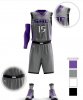
Here a mockup I found on reddit that shows a potential look for the uni. If they look like anything close to this ill be very happy.

Not sure exactly why the uniform reminds me of Rollerball. It isn't really a dead ringer... just that weird futuristic font.
I'm openminded to all this stuff though - these guys are good at marketing. I saw a pic of a faded purple t-shirt with the logo all white.. and it looked KILLER. But I couldn't find it in the team store on line so... maybe later.

They zoomed in so you didn't have to see the tacky McDonald's and Charmin logos plastered all over it after next year.