You are using an out of date browser. It may not display this or other websites correctly.
You should upgrade or use an alternative browser.
You should upgrade or use an alternative browser.
How do you feel about the new ALTERNATE jerseys?
- Thread starter VF21
- Start date

love_them_kings
Starter
wow, after all the speculation about jerseys this is what they really came up with... I'm not impressed.
PT Cruiser 9ROC
Bench
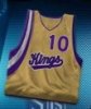
Here's a bigger and clearer look at them from NBA Live:
http://img234.imageshack.us/img234/7465/drakt39dc.jpg
They look at a bit odd to say the least, but they're out of context. You never know, they might look fantastic on the court and on an actual King. The new Pacers jerseys are ridiculously fantastic though.
http://img234.imageshack.us/img234/7465/drakt39dc.jpg
They look at a bit odd to say the least, but they're out of context. You never know, they might look fantastic on the court and on an actual King. The new Pacers jerseys are ridiculously fantastic though.
SiliconBreakfast
Prospect
Arrrrgh! Black was so much harder. What happened? Who chooses the gear? If it's the same people that design the website / media, we're screwed.
I can dig it. Something a little different to mix things up. That's dull gold I guess? Certainly not a traditional color combination, but I'm not going to be all close-minded and call it ugly. Ugliness is mostly a cultural simulacrum anyway. It's hard to look edgy or mean when you've got purple on all your uniforms. The white and purple uniforms certainly don't help to dissuade the "Queens" moniker. But even so, while I appreciate the "thinking outside the box" approach, at this point I'm still glad this isn't the the new full-time uniform. It's enough of a novelty to work for a half dozen games or so throughout the season.
allrightythen
Starter
I don't mind the design all that much, I just think the colors are kinda lame. Yellow and Purple? aren't those our arch rivals colors? So with those questions in mind, I Hate them!
love_them_kings
Starter
VF21 said:hrdboild - I think the most vocal objection isn't about them being ugly. It's about the color selection itself. Gold with purple... as in Laker colors.
yep. I did a doubletake when I first opened the thread... just doesn't look like a kings jersey to me.
Diabeticwonder
Bench
hrdboild said:I can dig it. Something a little different to mix things up. That's dull gold I guess? Certainly not a traditional color combination, but I'm not going to be all close-minded and call it ugly. Ugliness is mostly a cultural simulacrum anyway. It's hard to look edgy or mean when you've got purple on all your uniforms. The white and purple uniforms certainly don't help to dissuade the "Queens" moniker. But even so, while I appreciate the "thinking outside the box" approach, at this point I'm still glad this isn't the the new full-time uniform. It's enough of a novelty to work for a half dozen games or so throughout the season.
My sentiments exactly. The powder blue unis that they wore a number of times last year didn't do much for me, but for a few games here and there it wasn't all that bad. However, I am a bit concerned or amazed as to how "gold" became the prominent color on these uniforms when a certain team down south has gold as their color. Oh well, when it's all said and done it's about wins and losses and I'm confident that the team up north will have more wins than the team down south. They could wear the Padres uniforms from the 1980's and if they won the title I wouldn't care.
As an aside, this whole "gold" thing may be an attempt by the Kings to make a connection to the city of Sacramento and its history; the discovery of gold.
T
thesanityannex
Guest
What in the hell were they thinking??? Why not just copy a winning teams colors like the spurs or pistons, not a fallen dynasty's team colors.
I will never hear the end of this from my laker friend rivals.
I will never hear the end of this from my laker friend rivals.
T
thesanityannex
Guest
The brown, yellow, and orange. ummummgood. my favorite padres unirforms to date.Diabeticwonder said:They could wear the Padres uniforms from the 1980's and if they won the title I wouldn't care.
SiliconBreakfast
Prospect
thesanityannex said:What in the hell were they thinking??? Why not just copy a winning teams colors like the spurs or pistons, not a fallen dynasty's team colors.
I will never hear the end of this from my laker friend rivals.
HA, that's what I was thinking. Can't wait to hear my die-hard-Laker-fan of a step dad talk smack.
They really aren't that bad, just not the color scheme I picture the Kings wearing. I need to see the shorts though. Can we get an in game screen shot?
T
thesanityannex
Guest
The design itself is wonderful. It is the colors. That would be a nice jersey if the main color was black, and the stripes were purple and silver. Can anyone photoshop that design onto this hideous one.SiliconBreakfast said:HA, that's what I was thinking. Can't wait to hear my die-hard-Laker-fan of a step dad talk smack.
They really aren't that bad, just not the color scheme I picture the Kings wearing. I need to see the shorts though. Can we get an in game screen shot?
Diabeticwonder said:My sentiments exactly. The powder blue unis that they wore a number of times last year didn't do much for me, but for a few games here and there it wasn't all that bad. However, I am a bit concerned or amazed as to how "gold" became the prominent color on these uniforms when a certain team down south has gold as their color. Oh well, when it's all said and done it's about wins and losses and I'm confident that the team up north will have more wins than the team down south. They could wear the Padres uniforms from the 1980's and if they won the title I wouldn't care.
As an aside, this whole "gold" thing may be an attempt by the Kings to make a connection to the city of Sacramento and its history; the discovery of gold.
It might be about wins and losses but the uniform a team wears is what disguishes them from other teams. Each team should have their own distinct identity - with these uniforms the Kings are going to look like Laker clones and I think the team and the fans deserve much better than that.
"Oh, that was the Kings? I saw the colors and assumed it was the Lakers."
Blech again...
If the whole "gold" thing was an attempt by the Kings to make a connection to the city of Sacramento and its history, they might as well have put them in giant tomato suits.
")
It might have been a very good idea to begin with - but (to repeat again) the colors are ALREADY taken!
Pulp_Fiction_guy
Prospect
Mustard ? I dont know? but who knows the jerseys dont win ball games !!!
T
thesanityannex
Guest
If they were going for a Sacramento connection, they could have at least used the color copper to represent the cowbells of old.VF21 said:If the whole "gold" thing was an attempt by the Kings to make a connection to the city of Sacramento and its history, they might as well have put them in giant tomato suits.
allrightythen
Starter
VF21 said:If the whole "gold" thing was an attempt by the Kings to make a connection to the city of Sacramento and its history, they might as well have put them in giant tomato suits.
It might have been a very good idea to begin with - but (to repeat again) the colors are ALREADY taken!
They could at least use something besides purple if they were stuck on getting gold into the uniform. As a Kings fan (and subsequently a Laker Hater of sorts) its just a turnoff to see those same colors on my favorite and home team. If these unis are really what we're going to see this year I am going to be very dissapointed and someone needs to get fired.
Diabeticwonder
Bench
I agree with the sentiment that a team needs to have its own identity, but I don't really think that it's going to be that big of an issue if they play a handful of games in them. Also, I just showed the jersey to a friend of mine who is a huge Kings fan and his thought was that it is a different enough gold than what the Lakers use that it might be fine. Nevertheless, I have to see the whole thing; shorts and all on an actual player before I completely detest or love them.
Bballkingsrock
All-Star
Not really feeling them. They kinda look ugly, but too bad until we see them on the players and on the court.
Pulp_Fiction_guy said:Mustard ? I dont know? but who knows the jerseys dont win ball games !!!
Neither does posting on message boards or buying team jerseys to show your support of your favorite team.
Why do teams select new jerseys? It's purely about revenue. We, the consumers, are going to be expected to shell out our hard-earned $$$ for these.
Sorry, but there will not be a gold with purple Kings jersey hanging in my closet. Not now, not ever.
Gargamel
Starter
VF21 said:hrdboild - I think the most vocal objection isn't about them being ugly. It's about the color selection itself. Gold with purple... as in Laker colors.
Lol. The Kings are gonna get a lot of prodding from the league's fans about "just wanting to be like LA". I can see it already.
PT Cruiser 9ROC
Bench
thesanityannex said:The design itself is wonderful. It is the colors. That would be a nice jersey if the main color was black, and the stripes were purple and silver. Can anyone photoshop that design onto this hideous one.
I spent about 3 minutes on this, but it hopefully gets the point across. Looks decent in black.
http://img.photobucket.com/albums/v249/supasaiyan9md/KingsBlack.jpg
You and me both, Gargamel.
What kind of genius does it take to stay away from ONE particular color combination? Regardless of what the rationale behind it might have been, purple and gold weren't available. Unless, of course, the Lakers are going to switch to something like aquamarine and puce?
What kind of genius does it take to stay away from ONE particular color combination? Regardless of what the rationale behind it might have been, purple and gold weren't available. Unless, of course, the Lakers are going to switch to something like aquamarine and puce?
T
thesanityannex
Guest
PT Cruiser 9ROC said:I spent about 3 minutes on this, but it hopefully gets the point across. Looks decent in black.
http://img.photobucket.com/albums/v249/supasaiyan9md/KingsBlack.jpg
with help from ptcruiser9roc:

now that is a jersey.
thesanityannex said:...now that is a jersey.
It might be A jersey, but unfortunately it is not going to be OUR jersey.
This is a done deal. A fait accompli...and IMHO it's one of the lamest decisions ever made by the Kings organization and that INCLUDES the powder blue uniforms.
What were they thinking?
"Hey, great look. Good thing no other team has colors like that."
"Wow, I love it! And it's so unique."
"Lakers? Lakers who?"
etc. ad nauseum...
SaCTowNFeveR
Bench
They look good to me, but thats what I think
SacKingsFX
G-League
ugly colors man
purple and gold? lakers what?
purple and gold? lakers what?
That's the ugliest f***ing jersey I have ever seen.
Last edited by a moderator:
Similar threads
- Locked
- Poll
- Replies
- 574
- Views
- 25K
- Replies
- 37
- Views
- 4K