Logo - change or keep? (retitled with poll added)

What should we do about the logo?


  • Total voters
    59
  • Poll closed .
#31
Though I was not a fan of the shiny gold uniforms, I think the main problem was too much shiny gold. I would not be opposed to them bringing back shiny gold into the design repertoire if it wasn't the primary color. Gold accents or name/logos, I think, could look really good... and, since they are the "kings" it fits in nicely with the theme (Kings love gold, have gold crowns, etc)
 
#32
The golds were f**king horrific, but I honestly don't think they're in the top 5 of worst jerseys ever. There's some other pretty stellar candidates.

As for the baby blue uniforms, you could do a lot worse. There is nothing masculing or feminine about any colour, and I think anyone who thinks so isn't mentally bullet proof. Give me a pink jersey and I'm still going to beat your ass, and look absolutely fabulous in the process.
 

funkykingston

Super Moderator
Staff member
#33
Though I was not a fan of the shiny gold uniforms, I think the main problem was too much shiny gold. I would not be opposed to them bringing back shiny gold into the design repertoire if it wasn't the primary color. Gold accents or name/logos, I think, could look really good... and, since they are the "kings" it fits in nicely with the theme (Kings love gold, have gold crowns, etc)
I would agree with that. Accents are one thing but when the whole uniform is one shiny color it just doesn't work. The short lived Mavs alternates actually looked kind of cool in pictures but once somebody is moving in them they just looked like Hefty bags.


I have been a Sacramento Kings fan from the first day that there WERE Sacramento Kings but in all honesty the Kings have never once had a uniform that I thought looked great. Some have been worse than others but none have been amazing or classic IMO.

And I think part of that has always been trying to incorporate past elements of older uniforms that also weren't great. I like but don't love the first two uniforms from my list (the late 80's/early 90's Royal blue and the current black alternate) and I have an odd but minor affinity for the powdered blue but honestly maybe it's time to do a complete revamp without any touches from past designs.

I've always wished the Kings had something classic and timeless like the Lakers, Bulls, Celtics, Knicks etc but they don't. Part of that is chalked up to the team moving so often and part is just never having a great design to start with. But the Kings imagery SHOULD lend itself to a great design.
 
#34
I personally love the current black alternates. I'd like those to be the primary roads, incorporate the cursive Kings font into the white uniform and the purple alternate, and I'm set.
 
#35
Current alternate uniform is perfect, but it's been around for like 4-5 years now and I get why they want to change it:
In that leaked photo it's not that the baby-blue classic is going to be the alternate one, it's just that the team is going to wear it on "Hardwood classic" nights (last season was the Rochester one).

I think that the team's new alt uniform would be the sleeved jersey's. It had to happen someday,,,
 

VF21

Super Moderator Emeritus
SME
#37
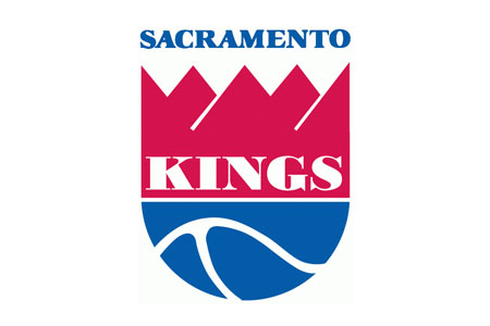
This is our logo


Everything about it screams retro. The grey is unnecessary added onto it. Even the font looks a little funky.

Most 1st year computer graphic students would tell you this logo sucks cause there's not a lot appeasing about it.

We've all grown used to it, but our logo sucks if you take a look at it from afar without the Fan goggles.

Maybe we should add grey to our jerseys since a lot of this does have grey.
That's YOUR opinion, which you're certainly entitled to. We get it...but it doesn't mean with have to agree with it.
 

VF21

Super Moderator Emeritus
SME
#38
The golds were f**king horrific, but I honestly don't think they're in the top 5 of worst jerseys ever. There's some other pretty stellar candidates.

As for the baby blue uniforms, you could do a lot worse. There is nothing masculing or feminine about any colour, and I think anyone who thinks so isn't mentally bullet proof. Give me a pink jersey and I'm still going to beat your ass, and look absolutely fabulous in the process.
You would had you ever had to sit and watch an entire game in person. If you sat close enough to the court, they were beyond hideous.
 

VF21

Super Moderator Emeritus
SME
#39
Current alternate uniform is perfect, but it's been around for like 4-5 years now and I get why they want to change it:
In that leaked photo it's not that the baby-blue classic is going to be the alternate one, it's just that the team is going to wear it on "Hardwood classic" nights (last season was the Rochester one).

I think that the team's new alt uniform would be the sleeved jersey's. It had to happen someday,,,
I can't find the link at the moment, but I do believe K Fippin over at StR said that leaked photo was refuted.
 
#40
That's YOUR opinion, which you're certainly entitled to. We get it...but it doesn't mean with have to agree with it.
What are you talking about lol. Someone incorrectly posted a pic of something that wasn't our official logo. I just posted our logo in response.

I'm not trying to convert anyone into my anti-90s logo club...even if I had one.
 

Bricklayer

Don't Make Me Use The Bat
#41
This is our logo


Everything about it screams retro. The grey is unnecessary added onto it. Even the font looks a little funky.

Most 1st year computer graphic students would tell you this logo sucks cause there's not a lot appeasing about it.

We've all grown used to it, but our logo sucks if you take a look at it from afar without the Fan goggles.

Maybe we should add grey to our jerseys since a lot of this does have grey.
Its the same exact logo, one of them is just cooled up, and the other is meant for letterhead and whatnot.

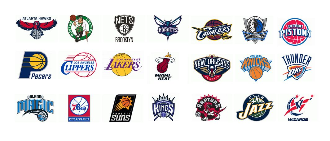
Perfectly acceptable in a world where these are the logos:


half of them are just team names over lined out balls. The Wizards just sucks The Magic is even worse. We have a dinosaur with a ball, a leprecahun with a ball. The Thunder has nothing to do with Thunder or even storms, Its just bleh. the Jazz are the word Jazz, over a ball, with a few mountains? The Cavs have our same general idea, but again just sitting over a damn ball. Enough with the balls. I have always liked the idea of the Suns'. I like the Pels angry bird. The Hawks could/should do more with theirs because the idea is strong. But in general we've got as much unique name-centered flavor to ours as just about anyone. "Sacramento Kings" over the top of a purple basketball would be a huge step back.
 
#42
Its the same exact logo, one of them is just cooled up, and the other is meant for letterhead and whatnot.

Perfectly acceptable in a world where these are the logos:


half of them are just team names over lined out balls. The Wizards just sucks The Magic is even worse. We have a dinosaur with a ball, a leprecahun with a ball. The Thunder has nothing to do with Thunder or even storms, Its just bleh. the Jazz are the word Jazz, over a ball, with a few mountains? The Cavs have our same general idea, but again just sitting over a damn ball. Enough with the balls. I have always liked the idea of the Suns'. I like the Pels angry bird. The Hawks could/should do more with theirs because the idea is strong. But in general we've got as much unique name-centered flavor to ours as just about anyone. "Sacramento Kings" over the top of a purple basketball would be a huge step back.
A few of those teams have new logos and I personally love Atlanta's. It's very clean and cut to the chase. I like the overall feel of the Wizards logo too.

I think ours is a bit weird.

The NBA requires teams to have either a basketball or the city in the logo. (There are teams that have multiple logos). The Kings chose to put both together like a lot of other teams. However, our basketball is minimized as is the city. Placement of the city is nice though. Our city name is an arch above the team name. It's a banner that starts from the K in kings and ends at the S of it. It connects the K and S which is pretty cool.

I don't know much about medieval times, but isn't the entire shape of our logo a shield? Knights are often associated with shields. So I do see the formation of a shield...but nvm it all. I don't think anyone wants to read about me breaking down what I see with our logo lol.

Just one question about it though....why are there grey lines at the handle of the spears? I think it points all signs to retro 90s.

I think our logo breaks rules, therefor making it unique. However, I'm just not a huge fan of the entire design. Of course we all have opinions, but I hope the FO choses to go a different route with our logo.
 

Bricklayer

Don't Make Me Use The Bat
#43
A few of those teams have new logos and I personally love Atlanta's. It's very clean and cut to the chase. I like the overall feel of the Wizards logo too.

I think ours is a bit weird.

The NBA requires teams to have either a basketball or the city in the logo. (There are teams that have multiple logos). The Kings chose to put both together like a lot of other teams. However, our basketball is minimized as is the city. Placement of the city is nice though. Our city name is an arch above the team name. It's a banner that starts from the K in kings and ends at the S of it. It connects the K and S which is pretty cool.

I don't know much about medieval times, but isn't the entire shape of our logo a shield? Knights are often associated with shields. So I do see the formation of a shield...but nvm it all. I don't think anyone wants to read about me breaking down what I see with our logo lol.

Just one question about it though....why are there grey lines at the handle of the spears? I think it points all signs to retro 90s.

I think our logo breaks rules, therefor making it unique. However, I'm just not a huge fan of the entire design. Of course we all have opinions, but I hope the FO choses to go a different route with our logo.
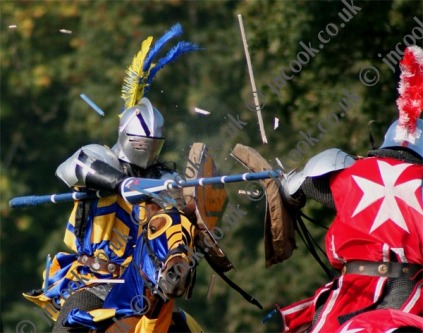
I don't think the candystriping was a great idea, but it is an attempt to represent this:


and probably hence to clarify that those are lances
 
#44
Its the same exact logo, one of them is just cooled up, and the other is meant for letterhead and whatnot.

Perfectly acceptable in a world where these are the logos:


half of them are just team names over lined out balls. The Wizards just sucks The Magic is even worse. We have a dinosaur with a ball, a leprecahun with a ball. The Thunder has nothing to do with Thunder or even storms, Its just bleh. the Jazz are the word Jazz, over a ball, with a few mountains? The Cavs have our same general idea, but again just sitting over a damn ball. Enough with the balls. I have always liked the idea of the Suns'. I like the Pels angry bird. The Hawks could/should do more with theirs because the idea is strong. But in general we've got as much unique name-centered flavor to ours as just about anyone. "Sacramento Kings" over the top of a purple basketball would be a huge step back.
I just now realized that every logo has a basketball in it. lol wow.
 
#46
And the Lances have always kinda bothered me too.
Really? It is interesting to get everyones opinions on this. I always found the lances to be a source of 'power' within the design, representing an "I will unseat you and probably jam you in the eye if I can" sort of moxie not contained in other logo's....... I fully understand that I may have a slight competition problem that lends me to more literal interpretation and there is no way they would ever let me carry an actual lance anywhere near the opposing team anymore........ I am pretty sure I burned that bridge during the bus trip to Golden State when, after buying the bus driver a ticket to the game last minute, I ended up (lost) on the court pre-game, with Kings flag flying on a lance like pole that would never be allowed now. I wish it was striped, in retrospect. Good, good times........ they are coming again=)
 

VF21

Super Moderator Emeritus
SME
#48
Really? It is interesting to get everyones opinions on this. I always found the lances to be a source of 'power' within the design, representing an "I will unseat you and probably jam you in the eye if I can" sort of moxie not contained in other logo's....... I fully understand that I may have a slight competition problem that lends me to more literal interpretation and there is no way they would ever let me carry an actual lance anywhere near the opposing team anymore........ I am pretty sure I burned that bridge during the bus trip to Golden State when, after buying the bus driver a ticket to the game last minute, I ended up (lost) on the court pre-game, with Kings flag flying on a lance like pole that would never be allowed now. I wish it was striped, in retrospect. Good, good times........ they are coming again=)
As an aside, I still think you are the primary reason the Kings quit handing out megaphones. :)
 
#53
And the Lances have always kinda bothered me too.

Same... We're Kings not Knights... Kings didn't really compete in jousting events afiak. The logo should be something like a crown, name, ball. Like a crown on top of a ball with the name Kings under it and sacramento across the ball? I could probably throw something together on photoshop when I am home today but I had always thought our logo was a bit "meh"
 

Capt. Factorial

ceterum censeo delendum esse Argentum
Staff member
#54
Same... We're Kings not Knights... Kings didn't really compete in jousting events afiak. The logo should be something like a crown, name, ball. Like a crown on top of a ball with the name Kings under it and sacramento across the ball? I could probably throw something together on photoshop when I am home today but I had always thought our logo was a bit "meh"
What, like this?


VF21

Super Moderator Emeritus
SME
#60
So the alternative jersey thread has become a fairly robust discussion of our logo. I have, therefore, added a poll...