
Logo - change or keep? (retitled with poll added)
- Thread starter Merdiesel
- Start date


Powder Blue not Baby Blue is my preferred naming. Still own my Theus jersey #24 in both powder blue and white with player name below number on both. Picture is from its winning top retro look few years back on ESPN.
http://espn.go.com/page2/s/nbaretro/030206.html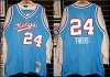
http://espn.go.com/page2/s/nbaretro/030206.html
There is no pride in wearing baby blue. Ever.
Funny thing is, and some Kings fans may already know this, that the powder blue jersey's were a complete mistake. The road uni's were supposed to be royal blue -- just like they were in KC and just like the royal blue trim on the home jerseys -- but the manufacturer screwed up. By the time the mistake was discovered, it was too late to fix in time for the season so they went with what they had.
Why on earth we'd want to revert to a uniform that was a complete mistake and sort of embodies much of our early (and recent) history in Sacramento is beyond me.
I say they bury those things in New Mexico right next to where they buried all those old Atari cartridges --- and throw in the gold throw backs while they're at it.
No. Just no.
Our logo is incredible and the colors completely fit in with the name of the team. Not everything needs to be changed.
Our logo is incredible and the colors completely fit in with the name of the team. Not everything needs to be changed.
It's time for change! We need a new logo and we're going to start a new era. I secretly hope we go back to royal blue for our primary color. As much as purple has been nice, royal blue is just much better. Purple can always be an alternative jersey..
Eh, maybe our colors can stay, but our logo needs to be re-branded. It looks really silly imo.. whoever designed it broke one of the firsts logo rules ever.. make it timeless. Ours screams 1995 lol
It's time for change! We need a new logo and we're going to start a new era. I secretly hope we go back to royal blue for our primary color. As much as purple has been nice, royal blue is just much better. Purple can always be an alternative jersey..
It's time for change! We need a new logo and we're going to start a new era. I secretly hope we go back to royal blue for our primary color. As much as purple has been nice, royal blue is just much better. Purple can always be an alternative jersey..
this works:

Logo is cool and has been for a long time. Its theme specific. Even if it were dated, which its not, you don't see the Celtics or Spurs running around flipping their logos around, and if the Clippers do here this summer the pics of the new one that's supposedly taking its place are a bad joke.
this works:
this works:
Also, our current color scheme is perfect. Purple is the color of royalty. The fact that the lakers also use purple should have no impact on how appropriate it is for OUR identity. WTF is a 'laker' anyway?? Let them pick a different color. Purple belongs to us. Gold I find tawdy and ostentatious, besides which, it does NOT translate to a color that can be worn on the court (reference the god awful gold jerseys and the laker version of which is personally best described as pee yellow) I see the silver as representative of a knights armor. Purple, Silver, Black for power. Why would you want to change that? and to what??
Also, our current color scheme is perfect. Purple is the color of royalty. The fact that the lakers also use purple should have no impact on how appropriate it is for OUR identity. WTF is a 'laker' anyway?? Let them pick a different color. Purple belongs to us. Gold I find tawdy and ostentatious, besides which, it does NOT translate to a color that can be worn on the court (reference the god awful gold jerseys and the laker version of which is personally best described as pee yellow) I see the silver as representative of a knights armor. Purple, Silver, Black for power. Why would you want to change that? and to what??
I think that if we changed our logo everyone would be begging to get it back because only then would some realize how nice it is compared to most logos.
Yeah, count me as one who really likes the Kings logo. I don't see any reason to change it.
As for the uniforms my 1-10 ranking of the road jerseys (from my favorite to least favorite) would go something like this:
1. The early 90's Royal Blue

2. The current black alternates

3. Mid 90's to early 2001 Black & Purple

4. The late 90's to early 2000 purple alternates

5. Mid 80's powder blue

6. Early to mid 2000's purple with "Sacramento" on the front

7. The current uniform

8. The split purple/black with the checkerboard sides

9. The gold jerseys

10. Any future jersey with sleeves.
As for the uniforms my 1-10 ranking of the road jerseys (from my favorite to least favorite) would go something like this:
1. The early 90's Royal Blue
2. The current black alternates
3. Mid 90's to early 2001 Black & Purple
4. The late 90's to early 2000 purple alternates
5. Mid 80's powder blue
6. Early to mid 2000's purple with "Sacramento" on the front
7. The current uniform
8. The split purple/black with the checkerboard sides
9. The gold jerseys
10. Any future jersey with sleeves.
Last edited:
I don't think the Kings will ever go back to the Royal Blue jerseys because it's too radical a departure from the black and purple and it shares the color scheme with the throwback Rochester jerseys.
I do wish they'd change the font for "Sacramento" or "Kings" on the jerseys though. I don't care for the current lettering. And even though it matches the logo (and should satisfy my OCD tendencies) I don't like the previous font either. In fact the only one I really like is the old school script lettering.
I do wish they'd change the font for "Sacramento" or "Kings" on the jerseys though. I don't care for the current lettering. And even though it matches the logo (and should satisfy my OCD tendencies) I don't like the previous font either. In fact the only one I really like is the old school script lettering.

Logo is cool and has been for a long time. Its theme specific. Even if it were dated, which its not, you don't see the Celtics or Spurs running around flipping their logos around, and if the Clippers do here this summer the pics of the new one that's supposedly taking its place are a bad joke.
this works:
this works:
Everything about it screams retro. The grey is unnecessary added onto it. Even the font looks a little funky.
Most 1st year computer graphic students would tell you this logo sucks cause there's not a lot appeasing about it.
We've all grown used to it, but our logo sucks if you take a look at it from afar without the Fan goggles.
Maybe we should add grey to our jerseys since a lot of this does have grey.