You are using an out of date browser. It may not display this or other websites correctly.
You should upgrade or use an alternative browser.
You should upgrade or use an alternative browser.
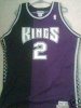
Pic of the new jersey
- Thread starter Simran2214
- Start date
jon e
Bench
downLets bring this back but make it full time. I dont think this would count as a "black" jersey because its almost 3/4 purple
")
oaklandking
G-League
if always thought that should be the jersey
SacTownKid
Hall of Famer
Where is it??? They took it down. Interesting...
Simran2214
Prospect
GeorgeofSacramento
Bench
At least it's not gold.
Andriod_KiNg
Starter
I really like them. Dark Purple with the Black is a great mix.
I dont normally get nba jerseys but I might have to get one these.
I dont normally get nba jerseys but I might have to get one these.
Dime Dropper
All-Star
I really like them. Going to order one of them off the 'net when they're available.
While in the NBA store in NY last week, the only Kings jersey they had was an Artest one. I passed, guessing he would be gone pretty soon. Good judgement call, glad I held out now! On a side note, I was pretty pissed that they only had Artest jerseys. They didn't even give the Kings they're own rack, whereas every other team had their own. We were just thrown in with a normal rack holding other teams jerseys.
While in the NBA store in NY last week, the only Kings jersey they had was an Artest one. I passed, guessing he would be gone pretty soon. Good judgement call, glad I held out now! On a side note, I was pretty pissed that they only had Artest jerseys. They didn't even give the Kings they're own rack, whereas every other team had their own. We were just thrown in with a normal rack holding other teams jerseys.
=LarryLegend=
Starter
I wonder is the home jerseys are going to be white with more black then purple?
Bricklayer
Don't Make Me Use The Bat
I like the cut and color of the new jersey, but I hate fact there's no "Sacramento" on the front. Wearing jerseys sporting Sacramento at home is ridiculous.
Why would they wear them with "Sacramento" at home, and not on the road? I assume it will say Kings both home and away?
the issue with "Sacramento" is always the clutter. And of course its difficult to work in the crown logo.
The Phantom
Prospect
Sacramento will be on the white home jerseys in white with a dark border, giving it a clean look
FakeInjury
Bench
Simple, and leaves room for expansion...The color could easily be changed, and it would fundamentally look the same....i like the jersey, even if it is a little too purple.
Bricklayer
Don't Make Me Use The Bat
Sacramento will be on the white home jerseys in white with a dark border, giving it a clean look
Well now I would agree that is strange. Other than blatantly pandering to the insecurities of the home crowd, why would you have Sacramento on your jerseys that you wear when playing in Sacramento, and not when you head elsewhere?
The Phantom
Prospect
Well now I would agree that is strange. Other than blatantly pandering to the insecurities of the home crowd, why would you have Sacramento on your jerseys that you wear when playing in Sacramento, and not when you head elsewhere?
For the simple reason you stated earlier....the Sacramento looked less cluttered on the white. From an asthetics pov, it's very clean.
Catalyst
G-League
Here's a link to Yahoo's blog with images of the new jerseys.
http://sports.yahoo.com/nba/blog/ba...ta-and-Sacramento-s-new-jerseys?urn=nba,97655
http://sports.yahoo.com/nba/blog/ba...ta-and-Sacramento-s-new-jerseys?urn=nba,97655
JerN820
Bench
Here's a link to Yahoo's blog with images of the new jerseys.
http://sports.yahoo.com/nba/blog/ba...ta-and-Sacramento-s-new-jerseys?urn=nba,97655
That is hilarious! The blogger has his girlfriend comment on them as if it is some serious business. LOL
Circa_1985_Fan
All-Star
I know the reason the Maloofs braintrust changed the away jerseys in the first place a few years back was to promote the city of Sacramento, which was great...I like the new ones I guess, probably better than the old ones and DEFINITELY better than the gold lame ones. 
JerN820
Bench
I know the reason the Maloofs braintrust changed the away jerseys in the first place a few years back was to promote the city of Sacramento, which was great...I like the new ones I guess, probably better than the old ones and DEFINITELY better than the gold lame ones.
Anything is better than the gold ones........Okay maybe not. If we had the same design as the new T'Wolves jerseys that would be worse. Yuck!

NME
Starter
Are these our new home jerseys or some kind of alternates?
I think those are our homie jerseys.
")
NikateeN
Bench
Those aren't official team jerseys...
Good, cuzz im not likin them at all.
Similar threads
- Replies
- 4
- Views
- 1K