Kings Have a new Logo
- Thread starter nebs
- Start date
From the link. Here's what NBA 2K has:


per https://twitter.com/conradburry/status/742791879201161216
Definitely. It loses the throwback appeal if it's used that regularly. It becomes more of an alternate. And extra confusing when the actual alternate looked almost exactly the same but in black.

With the new alternate and the new stretch uniform the baby blues would be more of a departure, especially if used more sparingly.
Agreed on the camo and I would still want the lion/ball logo at the bottom of the shorts, but just based on the mockups I like the granite mockup a lot more.

With the new alternate and the new stretch uniform the baby blues would be more of a departure, especially if used more sparingly.
Agreed on the camo and I would still want the lion/ball logo at the bottom of the shorts, but just based on the mockups I like the granite mockup a lot more.
I still like this alternate black version better than the new one. The new home and away versions are very normal but may be slightly better.
I'm bumping this thread because new details on the uniforms came out today. Sounds like they came from NBA 2K leaks, which are usually spot on. I like them!
What do you all think?
http://news.sportslogos.net/2016/06/14/2016-17-sacramento-kings-jerseys-leaked/


The below image of the black uniform is an estimated guess, based off of elements on our draft hat, which you can find in the article:

What do you all think?
http://news.sportslogos.net/2016/06/14/2016-17-sacramento-kings-jerseys-leaked/


The below image of the black uniform is an estimated guess, based off of elements on our draft hat, which you can find in the article:

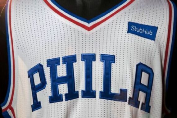
The league is starting the "Jersey Ad" program in the 2017-18 season. So anyone who's interested basically has 1 year to buy the jerseys or be stuck walking around advertising for some company. Not to mention, it just ruins the look of the jersey. Apparently the Sixers got $5 million a year from StubHub for 3 years so it's real money and I don't see the league cancelling it after the 3 year trial period ends. Let's just hope it doesn't turn into like soccer jerseys where the main logo is the main sponsor's.
Here is the Sixers version with the StubHub logo.

Here is the Sixers version with the StubHub logo.

Hmph, I'm surprised at all the negative reactions! I think they are very clean and I actually am pleasantly surprised at how all the grey looks. I think the crown at the V Neck is a nice touch, as is the "SAC" logo on the shorts.
Nothing flashy, but I think it was a very solid redesign. I do think I like our previous black alternates better, but I'll wait to see the real deal
Nothing flashy, but I think it was a very solid redesign. I do think I like our previous black alternates better, but I'll wait to see the real deal
