I was inspired to take a crack at it, and here's what I came up with...
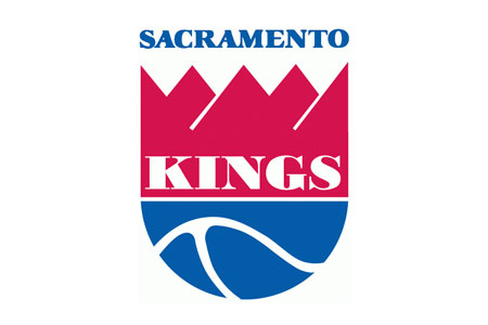
(1) Heritage Kings Logo (1985-1994):
I never liked this logo much. It doesn't really look like a crown and the font brings nothing to the table.
I wanted to take some kind of design element from this logo though to pay respect to the history of
basketball in Sacramento and I actually do like the swooping curve motif used on the bottom here
because it makes me think of the junction of the Sacramento and American rivers.
(2) Clip-Arty 90s Kings Logo (1994-Present):
This isn't a bad concept overall, I liked it a lot when it first came out. The color change alone is a huge
improvement and the symmetry of it is nice. The Sacramento scroll in particular looks kindof tacky to me
now though and it doesn't say anything about the city of Sacramento. It's a surface level concept without
a lot of inherent meaning. Also I think it's time to retire this particular block lettering and come up with
something fresher.
(3) Rough Concept Sketch
The first thing I did was extend the crown to make it look more like the modern interpretation used on the
Kings website and less like a famous member of the Simpsons. I also thought about extending the basketball
shape asymmetrically to make it look less rounded and more like a kind of shield. I was looking for an iconic
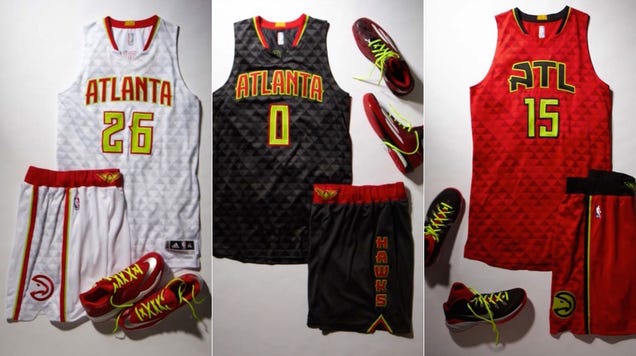
image like the Atlanta Hawk logo that is instantly recognizable and uncluttered with text so no need for the
redundant "Kings" letterhead on there or even the city name. I also added the stars for symbolic purposes -- more on that later.
(4) Detailed Colorized Rough Concept
I'm not a graphic designer so this is probably about as far as I can take this concept myself. It's still
pretty rough. I wanted to keep the colors simple, no silver accents just purple and black. I also decorated
the crown with facets and angles to make it look a bit like a city in perspective. It echoes the look of the
new arena a little bit as well in silhouette. I opted to round off the ball again here to make it look more
like a face, though I'm not sure if I like that better or not. The asymmetry of the first concept appeals to me as well.
So what's going on here?
Well it's still a basketball with a crown on it. That's the surface level.
The basketball itself is shaped like a head as well so it sortof looks like a King with a crown on his head too.
One level deeper, I said the stripes of the ball symbolize the two rivers that conjoin in downtown Sacramento
so this is an image of a city growing up toward the stars from a river basin below.
It's a promise of what the future holds for the region.
Thirdly I wanted to make some kind of a statement about what this team symbolizes. Why would a player
be proud to represent the Kings and Sacramento? What kind of shield would they proudly wear into battle?
Basically I think what we're trying to sell as a franchise, as an identity, are three things:
Unity,
Tradition, and
Loyalty.
The Kings are a family, we stick together. That's unity. If you play for the Kings you're going to be a part of a
winning tradition. You're going to know that this city fought hard to keep basketball as a part of it's future and
you're going to enjoy the undying loyalty of Sacramento fans. So that's why I put the stars on there.
The one on the left symbolizes Unity, the one on the right symbolizes Loyalty, and the one in the middle
symbolizes Tradition. All important qualities in any Kingdom.
Anyway, that's the type of thing I had in mind for what a new logo could be. Maybe it's too abstract?






.jpg)
.jpg)
.jpg)
.jpg)
