Kings Have a new Logo

#2
The web site says the image is black as required by the trademark filing, so we don't really know what the colors will be. I doubt the logo will be all black, likely a good amount of purple there.

As to whether this is legit or not, it fits the description I've heard...
 
#5
The web site says the image is black as required by the trademark filing, so we don't really know what the colors will be. I doubt the logo will be all black, likely a good amount of purple there.

As to whether this is legit or not, it fits the description I've heard...
Yeah. And while I agree, we are probably going to have purple, but the seats in the new arena are black. We are going to have some black color going on imo.
 

funkykingston

Super Moderator
Staff member
#10
Apparently NBA 3.0 means more international advertising and a Kings partnership with Löwenbräu


I'm not sure about the full lion but I dig the rest. Not the complete re-imagining I was expecting and maybe hoping for, but if these really are the new logos I'm cool with that.

And honestly I kind of hope the logos are all black. I think they look great that way.
 
Last edited:

hrdboild

Moloch in whom I dream Angels!
Staff member
#12
Eh, they just purple and blacked the old logo and changed the font. I'd give it a C for aesthetic appeal and a D for effort. I thought they might do something slightly interesting. This is as nondescript and uninspiring as the Phoenix Suns rebrand. I do like the lion logos though. I'd rather they re-work one of those into the primary logo. Hopefully the uniforms are better.
 

funkykingston

Super Moderator
Staff member
#16


I'm actually surprised by how much I dig this logo. The seams not only double as the lion's mane but also hint at an S.

Looking at it again it seems like with the crown doubling as a skyline the seams can also represent the Sacramento river. Just really cool with lots of detail while being simple and effective at the same time.

I wouldn't mind it as the primary logo really.
 
Last edited:
#17


I'm actually surprised by how much I dig this logo. The seams not only double as the lion's mane but also hint at an S.

Looking at it again it seems like with the crown doubling as a skyline the seams can also represent the Sacranento river. Just really cool with lots of detail while being simple and effective at the same time.

I wouldn't mind it as the primary logo really.
Reminds me a bit of the Pistons old alternate logo. But I like ours better.

http://www.sportslogos.net/logos/view/445/Detroit_Pistons/2002/Alternate_Logo
 

funkykingston

Super Moderator
Staff member
#18
Reminds me a bit of the Pistons old alternate logo. But I like ours better.

http://www.sportslogos.net/logos/view/445/Detroit_Pistons/2002/Alternate_Logo
The Pistons logo just isn't very cohesive to me. It looks like they were trying to have the horse look like a hood ornament but then it isn't connected the the other half of the basketball in any real way and the flames just seem like trying too hard to be cool and aggressive. I kind of see the idea behind that logo I just don't think the execution was there.
 

Bricklayer

Don't Make Me Use The Bat
#19
The first tone looks like the same garbage logo we had when the Kings first showed up. Hi, we're pussies, slap us around a bit.

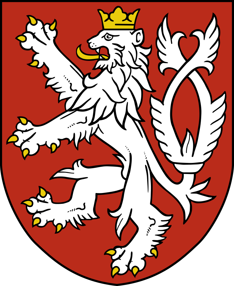
However I like the alternates. The "SAC" one improves the main and makes it a more iconic thing, and the lions are cool, even if the full standing lion is borrowed from some heraldic device, I have seen.

Edit -- or possibly from Lowenbrau as somebody else points out. :)


This is the best:

 
Last edited:

Bricklayer

Don't Make Me Use The Bat
#24
Standing lion symbol is also Peugot:
http://www.carscoops.com/2010/01/peugeot-reveals-new-lion-emblem.html

Also in common usage in Norse and northern European heraldry where the standing lion pose is called "lion rampant", and now I know why it looks so familiar to me -- I grew up with a shield with that symbol over the hearth in our family living room. Except with feathered wings (griffin).

In fact check out this shield of Conrad of Thuringa, Grandmaster of the Teutonic Knights, circa 1230 A.D.:


Obviously a big Kings fan :)
 
#27
Now I get it.... the crown is supposed to be mountain ranges. I'm assuming that the dips are valleys? If you connect the invisible lines, they form perfectly shaped triangles. Love this design even more!
 

Capt. Factorial

ceterum censeo delendum esse Argentum
Staff member
#29
To be honest, I'm not really going to miss the current logo - it's just a bit too busy.

Going back to something based on a long-time logo isn't a bad call, and I think there are a few improvements here on the old KC logo we've appropriated. The #1 improvement was to put the "Kings" text in color on a white strip instead of in white on background. That let them do two things - it allowed them to continue the seam of the ball up to the strip (a huge improvement) and it allowed them to pull the "Sacramento" text down into that white-on-background space above it. It's also going to let them put two colors into the logo without the odd thin-line discontinuity that the KC logo had. Compare this logo to the KC logo and it's just more compact, more clean. The font feels a bit blocky, but I'll get used to it.

The heraldic lion seems a bit out of place to me. "Look at me, I'm fierce and dribbling a basketball!"

I think coloring on the "lion ball" is going to be important. I'm kind of halfway on that one on first look. If they find a good way accentuate the "S" I think it will pop.