
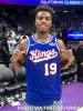
Kings tease jersey redesign
- Thread starter Tetsujin
- Start date
It’s a slightly sleeker font. Compare the latest trademark filing here: https://uspto.report/TM/97888496
to the older one here: https://uspto.report/TM/78247514
I’m a fan. While the 94-02 blacks are the best jerseys, the classic cursive Kings with the crown over the “i” is really the best font we’ve had. This new one looks like a nice modern upgrade on that. “Sacramento” is just too long for a jersey.
to the older one here: https://uspto.report/TM/78247514
I’m a fan. While the 94-02 blacks are the best jerseys, the classic cursive Kings with the crown over the “i” is really the best font we’ve had. This new one looks like a nice modern upgrade on that. “Sacramento” is just too long for a jersey.


Even though the Kings wore the red, white, and blue jerseys when I first became a fan in the early 90s, the team was generally pretty horrible when they wore them so it doesn't have any nostalgic appeal for me. Have they ever worn a Cincinnati Royals jersey as an alternate in the Sacramento era? It might be a cool idea to honor Oscar Robertson by wearing one of his 60s era designs for a game and inviting him out for a mid-game celebration at some point in the season.

If this is going back to something like the black cursive Kings jerseys the Kings wore during the Boogie era (I think), I'm a fan.
For my part, I have no particular feelings about the "script" Kings jerseys. There's nothing wrong with them, but they don't jump out at me as particularly attractive either.
Honestly, I wouldn't mind seeing an overall logo redesign that includes The Beam - sure, it's a gimmick, but it's fun and recognizable. And while The Beam obviously can't last forever, after just one season it's iconic enough to be identified with the team. We're already in a position where the Kings probably can't just "stop" doing The Beam, they have to "officially retire" it when its time is up. Incorporating it into the logo would give it a sort of natural shelf life...once the next logo redesign was due, it could easily be officially retired along with the previous logo or, if The Beam isn't stale yet, could be kept through another logo cycle.
The final image there suggests to me they might be teasing a full logo redesign rather than just a jersey redesign. I guess we will see.
For my part, I have no particular feelings about the "script" Kings jerseys. There's nothing wrong with them, but they don't jump out at me as particularly attractive either.
Honestly, I wouldn't mind seeing an overall logo redesign that includes The Beam - sure, it's a gimmick, but it's fun and recognizable. And while The Beam obviously can't last forever, after just one season it's iconic enough to be identified with the team. We're already in a position where the Kings probably can't just "stop" doing The Beam, they have to "officially retire" it when its time is up. Incorporating it into the logo would give it a sort of natural shelf life...once the next logo redesign was due, it could easily be officially retired along with the previous logo or, if The Beam isn't stale yet, could be kept through another logo cycle.
Yeah, I’m hearing the new script is for a compete jersey redesign, not just city edition. I agree that the Beam must be featured in the city edition, but I wonder if we’ll see a new city edition along with new standard jerseys (I forget if it’s necessarily a new one each year).
Still waiting on gold city edition jerseys with the tower records font.
")
Just found out that Shakey's was the first pizza franchise in the US. We used to love that stuff when I was a kid. Dad would sometimes grab a pepperoni pizza or two on the way home from work on Friday nights.
Off topic, but more info here:
Shakey’s Pizza Parlor building is a cherished Sacramento landmark | Valley Community Newspapers, Inc. (valcomnews.com)
Last edited:
Even though the Kings wore the red, white, and blue jerseys when I first became a fan in the early 90s, the team was generally pretty horrible when they wore them so it doesn't have any nostalgic appeal for me. Have they ever worn a Cincinnati Royals jersey as an alternate in the Sacramento era? It might be a cool idea to honor Oscar Robertson by wearing one of his 60s era designs for a game and inviting him out for a mid-game celebration at some point in the season.
I was at the game. Oscar was courtside. They lost to the Spurs. The uniforms were fresh though
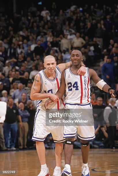
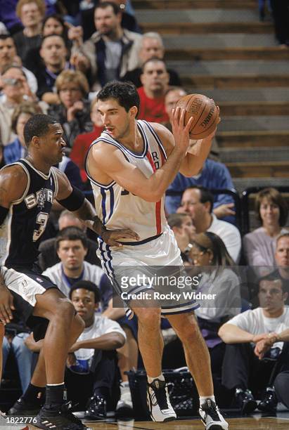
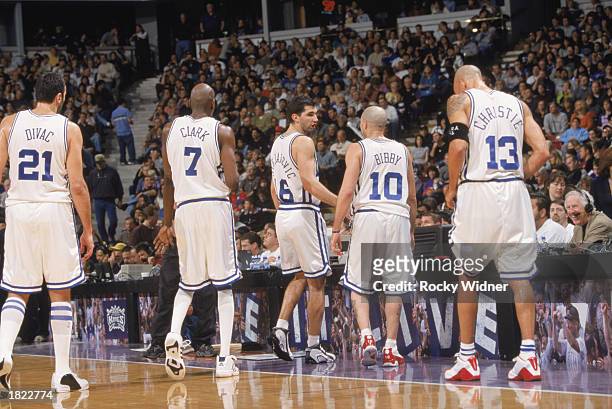
They did Oscar Robertson Day in 2003. They wore the white version of those.
I was at the game. Oscar was courtside. They lost to the Spurs. The uniforms were fresh though
I was at the game. Oscar was courtside. They lost to the Spurs. The uniforms were fresh though
I mean just show some damn consistency. Just stick with something. Find a font you love and roll with it forever.
no “sactown” stuff.
just Kings and Sacramento.
I would love to see a City Of Trees City edition Jersey though
no “sactown” stuff.
just Kings and Sacramento.
I would love to see a City Of Trees City edition Jersey though
Isn't this a bit early for a logo redesign? We had an entire logo overhaul in 2016.. are they changing the entire logo and colors?
I think they should switch the SAC ones to grey, use the cursive scripts on white and purple, and I’m not opposed to bringing back the 95-02 style black uniforms with the cursive Sactown or Sacramento on it.
Having a Sacramento jersey is good but they should do it in cursive since it’s too long for the fonts they have always used. Especially the ones they started using after 01-02. Those have always ranked near the bottom of kings jerseys. The grey Sacramento ones from last season were even worse:
can’t wait to see them.
I suspect we will see most of them before the draft.